Designing for sensory diversity in digital planning tools
Sensory-friendly design supports neurodivergent people by reducing overwhelm, honoring sensory needs, and making planning tools feel usable and safe.
No items found.

Sensory-friendly design supports neurodivergent people by reducing overwhelm, honoring sensory needs, and making planning tools feel usable and safe.
Most people think about accessibility in terms of screen readers and keyboard navigation, but sensory design represents a different frontier entirely. For neurodivergent people, the difference between a helpful planning tool and an overwhelming digital experience often comes down to how light, motion, sound, and visual elements interact with their unique sensory processing patterns.
We've learned that people often arrive at planning tools already feeling activated, overwhelmed, or struggling with executive functioning differences. This means every design choice carries extra weight because what might be a minor annoyance for some users can trigger complete shutdown for others. Creating supportive digital environments requires understanding how sensory diversity actually shows up in neurodivergent experiences and building flexibility that doesn't sacrifice clarity.
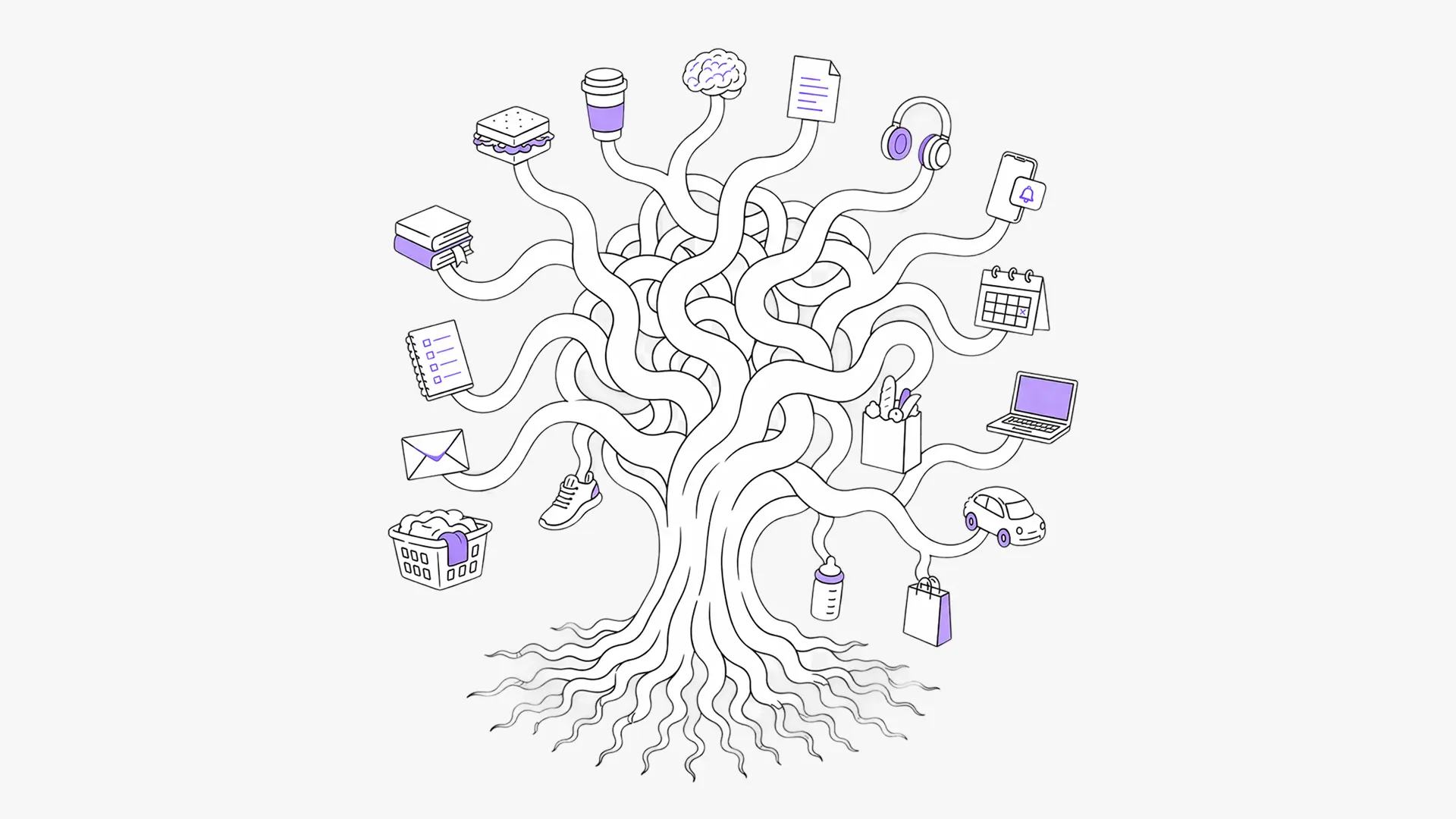
Sensory processing involves far more complexity than the traditional five senses. The vestibular system governs movement and balance, proprioception manages body awareness in space, and interoception handles internal signals like hunger, fatigue, or emotional states. For neurodivergent people, these systems often work in distinctive patterns that create both sensitivities and seeking behaviors.
An Autistic person might find certain visual patterns deeply soothing while being completely overwhelmed by unexpected sounds or sudden movements. An ADHD'er might need visual stimulation to maintain focus but struggle when too many competing elements demand attention simultaneously. These differences fluctuate throughout the day based on stress levels, energy, and environmental factors, which means rigid design approaches often fail when people need support most.
When sensory needs clash with digital interfaces, the consequences range from mild distraction to complete task abandonment. Someone might open a planning app with genuine motivation to organize their day but immediately feel overwhelmed by busy layouts, jarring transitions, or visual chaos that makes their brain freeze. These moments of sensory mismatch can derail planning momentum and reinforce negative associations with organization tools.
Understanding these patterns helps explain why traditional productivity apps often fail neurodivergent users despite having robust feature sets. The problem frequently lies in sensory presentation rather than functional capability.
Designing sensory-conscious digital experiences involves different considerations than creating accessible physical spaces. In apps, we work with light emissions, motion patterns, haptic feedback, and audio cues that can either support cognitive processing or completely derail it. Unlike physical environments where people can adjust lighting or background noise, digital interfaces control the entire sensory environment within their boundaries.
The challenge becomes particularly complex because people approach planning tools from vastly different sensory states. Someone might need calm, minimal interfaces when feeling overstimulated, but require more visual engagement and movement when struggling with understimulation or attention regulation. Building for this variability requires flexible systems that can adapt to different sensory needs without becoming overwhelming to configure.

Our visual Today timeline presents your day as a clear flow where past tasks become greyed out so you can focus on what comes next. This natural progression reduces cognitive load by directing attention to current and upcoming tasks rather than creating visual competition with completed items. The timeline approach supports natural scanning patterns while the greying effect provides gentle visual hierarchy without harsh contrasts.
Tasks use color-coding and icons that you can customize or let us recommend based on activity type, helping you quickly scan and identify what needs attention. External calendars get their own assigned colors and icons when you want them, creating consistent visual patterns that reduce the mental energy needed to distinguish between different types of commitments.

Widgets surface your next task, focus timer, or to-do list directly on your home screen and lock screen without requiring you to open the full app. Live Activities keep your current task visible on your lock screen, while Dynamic Island integration lets iPhone users see progress without switching contexts. This reduces the sensory disruption of constantly opening and closing apps, which can be particularly jarring for people managing attention difficulties or transition challenges.

The settings menu offers focused options rather than endless configurations because choice overload creates its own cognitive burden. You can adjust theme colors, switch between light and dark appearance modes, toggle dyslexia-friendly fonts, control all sounds and haptic feedback, and even change your app icon seasonally for visual refresh.
The key principle involves providing meaningful flexibility without requiring extensive setup to achieve basic usability. If bare-bones simplicity works better, you can skip adding icons, subtask lists, or other visual elements entirely. You can also expand or minimize your Today tab to see more or less information based on your current capacity.

Drag and drop functionality lets you adjust your Today timeline through direct manipulation rather than complex menus, which often feels more intuitive and less cognitively demanding. The web planner extends this approach with detailed views and seamless syncing across devices, reducing the friction of switching between phone and computer workflows.
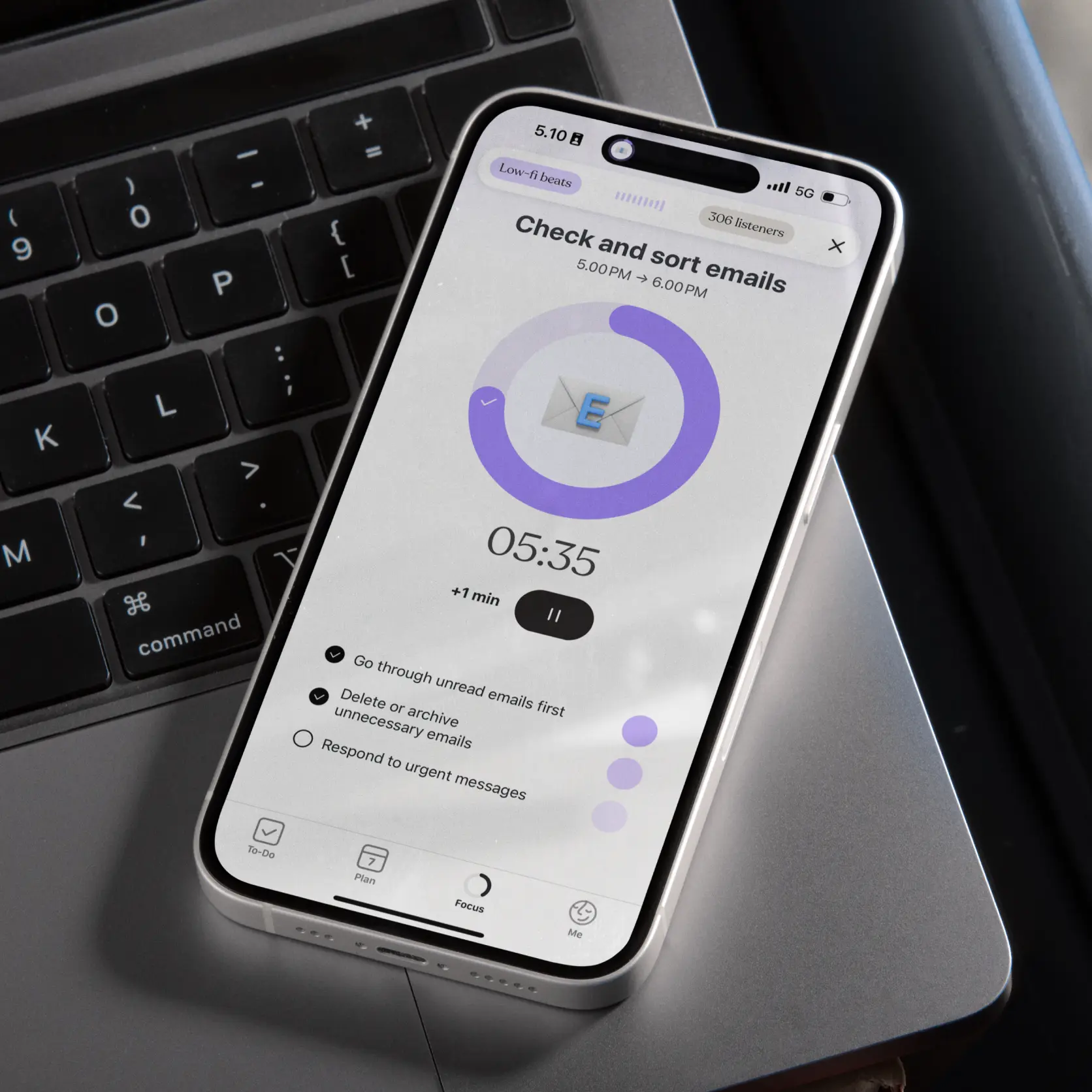
Animations move slowly and subtly, designed to guide attention rather than demand it. Movement helps indicate progress and mark transitions between tasks without creating visual chaos or triggering startle responses. Focus timer integration makes time visible through gentle visual progression rather than aggressive alerts.

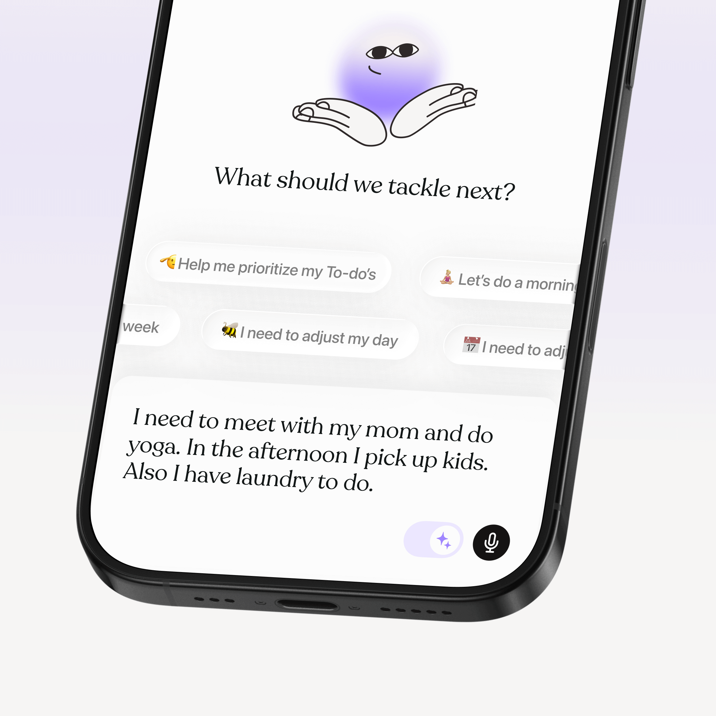
Templates and AI Co-Planning suggestions reduce blank-slate paralysis by providing structure without imposing rigid requirements. The Co-planner helps transform scattered thoughts into organized plans, which particularly supports people who struggle with task initiation or feel overwhelmed by unstructured planning.
Notification customization lets you choose reminders that support your routine without overwhelming you, including motivational check-ins and daily reviews that you can adjust or turn off entirely. You can create your own timed reminders for things like eating, resting, or drinking water to support interoception, which can be particularly challenging for neurodivergent people. Visual schedules make routines feel predictable and manageable.

Calendar import with visual organization through colors and icons creates consistent patterns across different scheduling systems. Multiple profile support allows shared use without sensory conflicts, since each person can maintain their own visual preferences and notification settings. Everything syncs automatically once set up, reducing ongoing maintenance cognitive load.
Many team members are neurodivergent themselves, which means we design based on genuine understanding of these challenges rather than theoretical accessibility guidelines. We build features we actually need in our own lives, then expand and refine through feedback from users who navigate the world with different sensory profiles.
User insights shape everything from font selections to transition timing because we've learned that sensory preferences involve deeply personal patterns that can't be solved through assumptions alone. This approach embeds accessibility considerations in foundational design decisions rather than treating them as afterthoughts.
Designing for diverse sensory needs while maintaining clear, streamlined experiences requires careful balance. Attempting to accommodate every possible preference often results in diluted products that work poorly for everyone, so our approach focuses on creating strong defaults that serve most users well while providing targeted adjustments for specific needs.
Core functionality remains immediately accessible without requiring extensive customization, but meaningful flexibility exists for people who need different sensory configurations. The goal becomes enhancing the experience for people with specific needs without complicating it for those who don't require adjustments, creating a foundation that works broadly while supporting individual differences.

Sensory design evolves continuously as we learn more about how different people process digital environments and as technology becomes more advanced. We're expanding dark mode options and low-stimulation themes, improving screen reader support, and refining how audio cues integrate with routine features. We're also working on smoother transitions for users with vestibular sensitivities.
We partner closely with Apple and work to integrate new accessibility features as they're announced, making the most out of what's possible in terms of inclusive design. In 2024, this work was recognized when we were named a finalist for the Apple Design Awards in the Inclusivity category. Every support request, app review, and beta test reveals new insights about sensory accessibility because these needs are deeply personal and can't be fully anticipated through design research alone.
Sensory diversity represents a fundamental aspect of how neurodivergent people navigate planning, focus, and daily organization. By designing digital experiences that accommodate different sensory processing patterns, we create tools that genuinely support diverse ways of thinking and being in the world.
This work requires ongoing commitment, community input, and willingness to iterate based on real feedback from people whose sensory experiences have been marginalized by mainstream design approaches. We're building something that works better for everyone by centering neurodivergent needs rather than treating them as edge cases.
The future of inclusive design lies not in retrofitting accessibility features onto existing products, but in reimagining how technology can be fundamentally more human from the start. Every sensory consideration we build into Tiimo moves us closer to a world where planning tools truly support the beautiful diversity of how minds work, rather than demanding conformity to artificial standards of "normal."

Sensory-friendly design supports neurodivergent people by reducing overwhelm, honoring sensory needs, and making planning tools feel usable and safe.
Most people think about accessibility in terms of screen readers and keyboard navigation, but sensory design represents a different frontier entirely. For neurodivergent people, the difference between a helpful planning tool and an overwhelming digital experience often comes down to how light, motion, sound, and visual elements interact with their unique sensory processing patterns.
We've learned that people often arrive at planning tools already feeling activated, overwhelmed, or struggling with executive functioning differences. This means every design choice carries extra weight because what might be a minor annoyance for some users can trigger complete shutdown for others. Creating supportive digital environments requires understanding how sensory diversity actually shows up in neurodivergent experiences and building flexibility that doesn't sacrifice clarity.
Sensory processing involves far more complexity than the traditional five senses. The vestibular system governs movement and balance, proprioception manages body awareness in space, and interoception handles internal signals like hunger, fatigue, or emotional states. For neurodivergent people, these systems often work in distinctive patterns that create both sensitivities and seeking behaviors.
An Autistic person might find certain visual patterns deeply soothing while being completely overwhelmed by unexpected sounds or sudden movements. An ADHD'er might need visual stimulation to maintain focus but struggle when too many competing elements demand attention simultaneously. These differences fluctuate throughout the day based on stress levels, energy, and environmental factors, which means rigid design approaches often fail when people need support most.
When sensory needs clash with digital interfaces, the consequences range from mild distraction to complete task abandonment. Someone might open a planning app with genuine motivation to organize their day but immediately feel overwhelmed by busy layouts, jarring transitions, or visual chaos that makes their brain freeze. These moments of sensory mismatch can derail planning momentum and reinforce negative associations with organization tools.
Understanding these patterns helps explain why traditional productivity apps often fail neurodivergent users despite having robust feature sets. The problem frequently lies in sensory presentation rather than functional capability.
Designing sensory-conscious digital experiences involves different considerations than creating accessible physical spaces. In apps, we work with light emissions, motion patterns, haptic feedback, and audio cues that can either support cognitive processing or completely derail it. Unlike physical environments where people can adjust lighting or background noise, digital interfaces control the entire sensory environment within their boundaries.
The challenge becomes particularly complex because people approach planning tools from vastly different sensory states. Someone might need calm, minimal interfaces when feeling overstimulated, but require more visual engagement and movement when struggling with understimulation or attention regulation. Building for this variability requires flexible systems that can adapt to different sensory needs without becoming overwhelming to configure.
Our visual Today timeline presents your day as a clear flow where past tasks become greyed out so you can focus on what comes next. This natural progression reduces cognitive load by directing attention to current and upcoming tasks rather than creating visual competition with completed items. The timeline approach supports natural scanning patterns while the greying effect provides gentle visual hierarchy without harsh contrasts.
Tasks use color-coding and icons that you can customize or let us recommend based on activity type, helping you quickly scan and identify what needs attention. External calendars get their own assigned colors and icons when you want them, creating consistent visual patterns that reduce the mental energy needed to distinguish between different types of commitments.
Widgets surface your next task, focus timer, or to-do list directly on your home screen and lock screen without requiring you to open the full app. Live Activities keep your current task visible on your lock screen, while Dynamic Island integration lets iPhone users see progress without switching contexts. This reduces the sensory disruption of constantly opening and closing apps, which can be particularly jarring for people managing attention difficulties or transition challenges.
The settings menu offers focused options rather than endless configurations because choice overload creates its own cognitive burden. You can adjust theme colors, switch between light and dark appearance modes, toggle dyslexia-friendly fonts, control all sounds and haptic feedback, and even change your app icon seasonally for visual refresh.
The key principle involves providing meaningful flexibility without requiring extensive setup to achieve basic usability. If bare-bones simplicity works better, you can skip adding icons, subtask lists, or other visual elements entirely. You can also expand or minimize your Today tab to see more or less information based on your current capacity.
Drag and drop functionality lets you adjust your Today timeline through direct manipulation rather than complex menus, which often feels more intuitive and less cognitively demanding. The web planner extends this approach with detailed views and seamless syncing across devices, reducing the friction of switching between phone and computer workflows.
Animations move slowly and subtly, designed to guide attention rather than demand it. Movement helps indicate progress and mark transitions between tasks without creating visual chaos or triggering startle responses. Focus timer integration makes time visible through gentle visual progression rather than aggressive alerts.
Templates and AI Co-Planning suggestions reduce blank-slate paralysis by providing structure without imposing rigid requirements. The Co-planner helps transform scattered thoughts into organized plans, which particularly supports people who struggle with task initiation or feel overwhelmed by unstructured planning.
Notification customization lets you choose reminders that support your routine without overwhelming you, including motivational check-ins and daily reviews that you can adjust or turn off entirely. You can create your own timed reminders for things like eating, resting, or drinking water to support interoception, which can be particularly challenging for neurodivergent people. Visual schedules make routines feel predictable and manageable.
Calendar import with visual organization through colors and icons creates consistent patterns across different scheduling systems. Multiple profile support allows shared use without sensory conflicts, since each person can maintain their own visual preferences and notification settings. Everything syncs automatically once set up, reducing ongoing maintenance cognitive load.
Many team members are neurodivergent themselves, which means we design based on genuine understanding of these challenges rather than theoretical accessibility guidelines. We build features we actually need in our own lives, then expand and refine through feedback from users who navigate the world with different sensory profiles.
User insights shape everything from font selections to transition timing because we've learned that sensory preferences involve deeply personal patterns that can't be solved through assumptions alone. This approach embeds accessibility considerations in foundational design decisions rather than treating them as afterthoughts.
Designing for diverse sensory needs while maintaining clear, streamlined experiences requires careful balance. Attempting to accommodate every possible preference often results in diluted products that work poorly for everyone, so our approach focuses on creating strong defaults that serve most users well while providing targeted adjustments for specific needs.
Core functionality remains immediately accessible without requiring extensive customization, but meaningful flexibility exists for people who need different sensory configurations. The goal becomes enhancing the experience for people with specific needs without complicating it for those who don't require adjustments, creating a foundation that works broadly while supporting individual differences.
Sensory design evolves continuously as we learn more about how different people process digital environments and as technology becomes more advanced. We're expanding dark mode options and low-stimulation themes, improving screen reader support, and refining how audio cues integrate with routine features. We're also working on smoother transitions for users with vestibular sensitivities.
We partner closely with Apple and work to integrate new accessibility features as they're announced, making the most out of what's possible in terms of inclusive design. In 2024, this work was recognized when we were named a finalist for the Apple Design Awards in the Inclusivity category. Every support request, app review, and beta test reveals new insights about sensory accessibility because these needs are deeply personal and can't be fully anticipated through design research alone.
Sensory diversity represents a fundamental aspect of how neurodivergent people navigate planning, focus, and daily organization. By designing digital experiences that accommodate different sensory processing patterns, we create tools that genuinely support diverse ways of thinking and being in the world.
This work requires ongoing commitment, community input, and willingness to iterate based on real feedback from people whose sensory experiences have been marginalized by mainstream design approaches. We're building something that works better for everyone by centering neurodivergent needs rather than treating them as edge cases.
The future of inclusive design lies not in retrofitting accessibility features onto existing products, but in reimagining how technology can be fundamentally more human from the start. Every sensory consideration we build into Tiimo moves us closer to a world where planning tools truly support the beautiful diversity of how minds work, rather than demanding conformity to artificial standards of "normal."
Sensory-friendly design supports neurodivergent people by reducing overwhelm, honoring sensory needs, and making planning tools feel usable and safe.


Most people think about accessibility in terms of screen readers and keyboard navigation, but sensory design represents a different frontier entirely. For neurodivergent people, the difference between a helpful planning tool and an overwhelming digital experience often comes down to how light, motion, sound, and visual elements interact with their unique sensory processing patterns.
We've learned that people often arrive at planning tools already feeling activated, overwhelmed, or struggling with executive functioning differences. This means every design choice carries extra weight because what might be a minor annoyance for some users can trigger complete shutdown for others. Creating supportive digital environments requires understanding how sensory diversity actually shows up in neurodivergent experiences and building flexibility that doesn't sacrifice clarity.
Sensory processing involves far more complexity than the traditional five senses. The vestibular system governs movement and balance, proprioception manages body awareness in space, and interoception handles internal signals like hunger, fatigue, or emotional states. For neurodivergent people, these systems often work in distinctive patterns that create both sensitivities and seeking behaviors.
An Autistic person might find certain visual patterns deeply soothing while being completely overwhelmed by unexpected sounds or sudden movements. An ADHD'er might need visual stimulation to maintain focus but struggle when too many competing elements demand attention simultaneously. These differences fluctuate throughout the day based on stress levels, energy, and environmental factors, which means rigid design approaches often fail when people need support most.
When sensory needs clash with digital interfaces, the consequences range from mild distraction to complete task abandonment. Someone might open a planning app with genuine motivation to organize their day but immediately feel overwhelmed by busy layouts, jarring transitions, or visual chaos that makes their brain freeze. These moments of sensory mismatch can derail planning momentum and reinforce negative associations with organization tools.
Understanding these patterns helps explain why traditional productivity apps often fail neurodivergent users despite having robust feature sets. The problem frequently lies in sensory presentation rather than functional capability.
Designing sensory-conscious digital experiences involves different considerations than creating accessible physical spaces. In apps, we work with light emissions, motion patterns, haptic feedback, and audio cues that can either support cognitive processing or completely derail it. Unlike physical environments where people can adjust lighting or background noise, digital interfaces control the entire sensory environment within their boundaries.
The challenge becomes particularly complex because people approach planning tools from vastly different sensory states. Someone might need calm, minimal interfaces when feeling overstimulated, but require more visual engagement and movement when struggling with understimulation or attention regulation. Building for this variability requires flexible systems that can adapt to different sensory needs without becoming overwhelming to configure.
Our visual Today timeline presents your day as a clear flow where past tasks become greyed out so you can focus on what comes next. This natural progression reduces cognitive load by directing attention to current and upcoming tasks rather than creating visual competition with completed items. The timeline approach supports natural scanning patterns while the greying effect provides gentle visual hierarchy without harsh contrasts.
Tasks use color-coding and icons that you can customize or let us recommend based on activity type, helping you quickly scan and identify what needs attention. External calendars get their own assigned colors and icons when you want them, creating consistent visual patterns that reduce the mental energy needed to distinguish between different types of commitments.
Widgets surface your next task, focus timer, or to-do list directly on your home screen and lock screen without requiring you to open the full app. Live Activities keep your current task visible on your lock screen, while Dynamic Island integration lets iPhone users see progress without switching contexts. This reduces the sensory disruption of constantly opening and closing apps, which can be particularly jarring for people managing attention difficulties or transition challenges.
The settings menu offers focused options rather than endless configurations because choice overload creates its own cognitive burden. You can adjust theme colors, switch between light and dark appearance modes, toggle dyslexia-friendly fonts, control all sounds and haptic feedback, and even change your app icon seasonally for visual refresh.
The key principle involves providing meaningful flexibility without requiring extensive setup to achieve basic usability. If bare-bones simplicity works better, you can skip adding icons, subtask lists, or other visual elements entirely. You can also expand or minimize your Today tab to see more or less information based on your current capacity.
Drag and drop functionality lets you adjust your Today timeline through direct manipulation rather than complex menus, which often feels more intuitive and less cognitively demanding. The web planner extends this approach with detailed views and seamless syncing across devices, reducing the friction of switching between phone and computer workflows.
Animations move slowly and subtly, designed to guide attention rather than demand it. Movement helps indicate progress and mark transitions between tasks without creating visual chaos or triggering startle responses. Focus timer integration makes time visible through gentle visual progression rather than aggressive alerts.
Templates and AI Co-Planning suggestions reduce blank-slate paralysis by providing structure without imposing rigid requirements. The Co-planner helps transform scattered thoughts into organized plans, which particularly supports people who struggle with task initiation or feel overwhelmed by unstructured planning.
Notification customization lets you choose reminders that support your routine without overwhelming you, including motivational check-ins and daily reviews that you can adjust or turn off entirely. You can create your own timed reminders for things like eating, resting, or drinking water to support interoception, which can be particularly challenging for neurodivergent people. Visual schedules make routines feel predictable and manageable.
Calendar import with visual organization through colors and icons creates consistent patterns across different scheduling systems. Multiple profile support allows shared use without sensory conflicts, since each person can maintain their own visual preferences and notification settings. Everything syncs automatically once set up, reducing ongoing maintenance cognitive load.
Many team members are neurodivergent themselves, which means we design based on genuine understanding of these challenges rather than theoretical accessibility guidelines. We build features we actually need in our own lives, then expand and refine through feedback from users who navigate the world with different sensory profiles.
User insights shape everything from font selections to transition timing because we've learned that sensory preferences involve deeply personal patterns that can't be solved through assumptions alone. This approach embeds accessibility considerations in foundational design decisions rather than treating them as afterthoughts.
Designing for diverse sensory needs while maintaining clear, streamlined experiences requires careful balance. Attempting to accommodate every possible preference often results in diluted products that work poorly for everyone, so our approach focuses on creating strong defaults that serve most users well while providing targeted adjustments for specific needs.
Core functionality remains immediately accessible without requiring extensive customization, but meaningful flexibility exists for people who need different sensory configurations. The goal becomes enhancing the experience for people with specific needs without complicating it for those who don't require adjustments, creating a foundation that works broadly while supporting individual differences.
Sensory design evolves continuously as we learn more about how different people process digital environments and as technology becomes more advanced. We're expanding dark mode options and low-stimulation themes, improving screen reader support, and refining how audio cues integrate with routine features. We're also working on smoother transitions for users with vestibular sensitivities.
We partner closely with Apple and work to integrate new accessibility features as they're announced, making the most out of what's possible in terms of inclusive design. In 2024, this work was recognized when we were named a finalist for the Apple Design Awards in the Inclusivity category. Every support request, app review, and beta test reveals new insights about sensory accessibility because these needs are deeply personal and can't be fully anticipated through design research alone.
Sensory diversity represents a fundamental aspect of how neurodivergent people navigate planning, focus, and daily organization. By designing digital experiences that accommodate different sensory processing patterns, we create tools that genuinely support diverse ways of thinking and being in the world.
This work requires ongoing commitment, community input, and willingness to iterate based on real feedback from people whose sensory experiences have been marginalized by mainstream design approaches. We're building something that works better for everyone by centering neurodivergent needs rather than treating them as edge cases.
The future of inclusive design lies not in retrofitting accessibility features onto existing products, but in reimagining how technology can be fundamentally more human from the start. Every sensory consideration we build into Tiimo moves us closer to a world where planning tools truly support the beautiful diversity of how minds work, rather than demanding conformity to artificial standards of "normal."
When you're ready, try Tiimo and make structure a little easier.

Why admin nights make boring life admin feel less lonely, less shamey, and easier to start.
ADHD dopamine menus can make motivation feel easier by reducing friction and supporting your brain.
ADHD decision fatigue can make even simple choices feel overwhelming. Here’s why it happens and how to reduce the mental load.